How do we measure the quality of a high school? Some schools have high test scores or send lots of kids to good colleges, but family and friends and general atmosphere probably matter far more for students’ odds at success. There are basic metrics such as the standardized tests du jour, which are very good at measuring how well students take standardized tests. The caliber of the hockey program is, of course, also an important consideration. (I jest…mostly.) Accurate measures are hard to find, though I’d still find more value in things like graduation rates and ACT or SAT scores, which, for all their flaws, are remarkably good predictors of college success. But assumes these schools are all starting from the same place, which they simply are not. A better question asks how schools work with the students they have, rather than wishing they had.
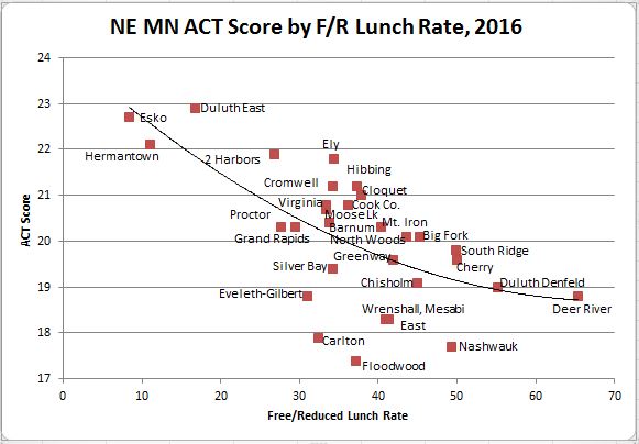
There’s no elegant way to control for income and parents’ education and all those things, but free/reduced lunch rates are one option. What happens, for example, if we graph average ACT scores from 2012-2015 in comparison to the free/reduced lunch rates at all traditional public high schools in northeast Minnesota? Well, this happens:

Click all images to enlarge.
Three schools stand out here: Duluth East, Esko, and Hermantown sit off by themselves at the upper left end of the graph. This shouldn’t be terribly surprising, as basically all of the wealthiest neighborhoods in the region feed into these three schools. Those demographics are friendly to strong test scores, but don’t necessarily mean a school is doing an especially good job in and of itself. Take Hermantown, for example: it’s a growing town, and invariably, young people who consider moving there talk about “the schools” as one of the reasons. Yet this graph suggests that Hermantown’s schools do a decidedly average job—even a slightly below average job—for the population they serve. People may think they’re moving for the schools, but whether they realize it or not, they’re moving for a demographic makeup that makes it easy to have a good-looking school by traditional metrics with far less effort. This is not to pick on Hermantown, which still does a reasonably good job of things, and there’s plenty to be said for wanting one’s children surrounded by other like-minded achievers. But it does show what a disservice we do when we rate schools by the most basic metrics.
At the risk of sounding a bit smug about my alma mater, East’s over-performance is actually pretty impressive given that it is already toward the high end; that said, it’s probably worth noting that East’s attendance area, while holding more poverty than Esko or Hermantown, also contains some uniquely wealthy and highly educated neighborhoods that may pull scores up. Its large student body also probably insulates it from dramatic year-to-year swings. The larger Range schools, meanwhile, perform quite well, as does Cloquet.
Denfeld, which is too often the source of less-than-happy stories about local education, modestly overachieves compared to the region. The school’s struggles when compared to its east side counterpart are entirely predictable based on who goes there, and this data suggests that’s not really the fault of the school. There may still be reasons to be leery of a place like Denfeld if it’s failing to offer the same advanced courses or difficult for students to build a schedule that incorporates those classes, but the school itself and its instructors seem to be doing fine. Places like Proctor and Wrenshall, though, where a number of kids in the Denfeld attendance area go to open enroll, actually underachieve. Floodwood, Carlton, and Bigfork all raise big red flags. High-poverty Deer River, meanwhile, exceeds expectations by a solid margin.
But wait, this may or may not be the most accurate way to do this: not everyone took the ACT until 2016, when the state of Minnesota required all students to sit for it. This is what happens when all students take the test, not just those who want to:
It’s one year of data, so the smaller sample is somewhat limiting, but the shift after the new requirement was predictable. Scores dropped across the board, since a lot of students who are not college-bound sat for a college aptitude test. Generally, this change makes well-off schools look better, and poorer schools look worse, as the steeper trendline shows. The wealthiest schools all hover around the lowest score drops, which probably reflects the fact that the bottom end in these schools is a lot higher than it is elsewhere. Meanwhile, we see big drops on the Range and in some of the poorer schools, including some schools that looked pretty good in the data from previous years, like Virginia and Cloquet. (To Cloquet’s credit, it still does pretty well.)
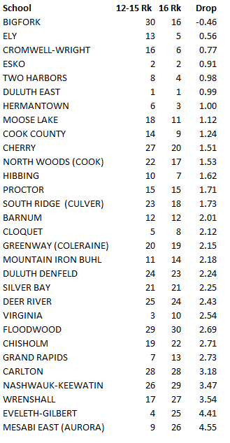
Drop in ACT scores when all students required to take test. The statewide average drop was 1.6.
There are two very contradictory ways to interpret this: one, these schools’ great scores from before tear down the curtains and suggest they’re not really that great, but instead serve their top students well while the rest shuffle along. Two, the ACT is not a great measure of what a high school is supposed to do: not every kid is destined for college, and maybe these schools are also educating the less academically-inclined kids well, and just channeling their talents in different directions. Most likely they are both true to some extent. (Worth noting: this region has an exceptionally high number of people with associate’s degrees or other degrees that are “less” than a bachelor’s degree, but can be tickets to good, steady employment in certain trades. At the same time, the region’s average ACT score is somewhat lower than the statewide average, whereas its graduation rate outpaces the state.)
One way to plausibly better judge a school’s performance is to measure graduation rates against free-reduced lunch rates. Even if kids aren’t going on to college, they’re still equipping kids with the basic skills and credentials for whatever they do next. Of course, one could also argue that these schools are just funneling under-qualified students through the system.

And, sure enough, if we correlate graduation rates and free/reduce lunch rates, we get a more complicated picture than with the test score graph, and see that some poor schools do an excellent job of getting students diplomas, while others do not. Here, the three affluent schools all under-perform the trendline mildly—though maybe the trendline should flatten out somewhat at higher levels—places like Greenway, Carlton, and Bigfork do a good job of graduating their students despite weak test scores.
The fundamental point here: just because a school has lower poverty rates does not necessarily mean it is good; just because it has higher rates does not mean it is bad. And yet educational reforms that supposedly aim to improve outcomes somewhere along the line, such as making all students take college aptitude tests whether or not they’re going to college or efforts to block teachers from teaching courses for college credit—a pitiful example of credential obsession at its worst—only tend to make the rich look richer and the poor look poorer. The rest becomes a self-fulfilling prophecy, as students drain out of the weaker-seeming schools and flock to the ones that appear strong, whether or not they really are actually better. Few things make my blood boil quite like educational bureaucracy and the underwhelming efforts to get around it.
The idea of rating schools is always fraught with difficulty, and I wouldn’t want to try to reduce the complicated things that go into an education to a single number. College rankings are trashy enough, and I say that even as someone who probably puts more stock in the value of educational prestige than most. If I had to pick out a few things I’d like to see to judge a school’s performance, though, I’d look for a high school’s college graduation rate (separated out for both bachelor’s and associate’s degrees). I’d also want a raw percentage of students earning the very highest test scores (say, ACTs over 30). And I’d control it by free/reduced lunch rate, because not all success is as it seems. It’s not a perfect way to gauge schools, but it’s at least an improvement over the poverty of current methods.
Data source: Minnesota Department of Education. Northeast Range High School (Babbitt) excluded due to lack of data.
