Tables
The following tables show the top and bottom ten census tracts in various categories using 2010 boundaries. Here again is the link to those boundaries.
I. Change in Population, 1970-2010

Click to enlarge all images. Colors denote region according to map in Part I.
Unsurprisingly, the big gainers are almost all on the edges of the city or beyond, and the losers are in the center or on the near west side of the city, save the unique East End tract.
II. Change in Poverty Rate, 1970-2010

The tracts that lost poverty over time are all over the map, but again excepting East End, they all enjoyed new development over the 40-year span, and some of them had a lot. It’s not surprising to see many of the biggest gainers in the center, but it is notable how poverty has leeched west out of Lower Lincoln Park (which was a high-poverty area to begin with) into its once less poor neighbors. Morgan Park and Chester Park are next to each other on the list, but their reasons for decline—loss of a steel mill versus the arrival of college students—could hardly be more different.
III. Highest Poverty, 1970 and 2010
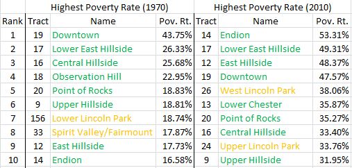
Most of these stay the same over time and are predictable, but the real eye-opener is just how much poverty has increased in these tracts over time. The poor have very clearly gotten poorer relative to everyone else, and much more concentrated.
IV. Lowest Poverty, 1970 and 2010

A couple of west side middle-class tracts drop off the list here, and are replaced by exurban areas. No surprises on the 2010 list, save maybe Lakeside landing at the very top.
V. Changes in Per Capita Income, 1970-2010

The exurbs had the farthest to climb, so it makes sense that they dominate the growth list. Most of the east side settles in just below them, all ahead of the national average. With a sample size of 38 tracts, it’s incredible to note that nearly a third of them had little or negative income growth over the 40-year period, despite the national average rising 50% over this time.
VI. Lowest Per Capita Income, 1970 and 2010
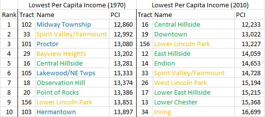
It’s interesting to note how many tracts are both low income and low poverty in 1970, particularly in the exurbs. Such tracts just don’t exist in 2010, with the low-income list coming to increasingly resemble the high poverty list. The closest thing to an exception is Bayview Heights, followed by the better-off west side tracts.
VII. Highest Per Capita Income, 1970 and 2010

No surprise to see the east side dominate the 1970 list, though a few rising exurbs and Park Point edge a few of those tracts down the list over time. Other than the growth in the college population in Hunters Park/Morley Heights, this really isn’t due to east side decline; just as there are more poor tracts in 2010, there are more comparatively rich ones as well. The city has stratified, as the much larger bands on the income map legend in the previous post show. The gap between the lower middle and the upper middle has grown significantly.
Methodology Notes
All of the data here comes from the U.S. census; 2000 and 2010 data is readily available online, and anything earlier comes from the University of Minnesota’s archives. Census tracts change somewhat over time, which is why a handful of west side tracts, which were once subdivided into several tracts, now have such large numbers. The census also reclassified UMD at some point, eliminating tract 8 and creating tract 157. The 1970 also overall figures include people residing on ships based out of Duluth, who are assigned to sub-tracts of the existing tracts. I threw them out of the comparison tables, though.
I focused on population and financial data because these are probably the easiest way to show general rise and decline. I use the federal government’s definition of the poverty line in each year. All income figures have been adjusted for inflation, in terms of 2010 dollars, using the Bureau of Labor Statistics’ Consumer Price Index Calculator. Analyses of job location, housing values, race, and various environmental factors could also prove fruitful in creating a more complete picture.
I made the maps with ArcGIS, census tract shapefiles available from the state, and the census data.
One could easily nitpick over some of my regional choices, and I wouldn’t disagree about many of them. For example, I waffled over where to put Tract 4 (Kenwood); it’s centrally located, but its 1970 demographics have more in common with east side neighborhoods than those in the center, and it’s also over the hill, and has seen considerable growth. Because of that growth, I ultimately put it in with the exurbs, though I could see arguments for other places. Tract 10 (Chester Park) also awkwardly straddles a few different areas, but since a little more of its population looks to be toward the east side, I put it there instead of in the center. One will also note that boundary with Hermantown and a township or two don’t line up with census tracts, so it’s impossible to get city-level data using the tract method. (That could be easily fixed by using census-designated places, but that would rob us of the ability to make comparisons among neighborhoods.) As mentioned in the main post, Bayview Heights’ placement is also debatable.
I threw out Census Tract 157 (UMD) from the tables above, as the census seems to count students differently over time, so the numbers lurch all over the place. Its numbers remain in use for area-wide analyses, though. There are cases for doing the same with Tract 10 (Chester Park), Tract 4 (Kenwood), and perhaps even places like Tract 5 (Hunters Park/Morley Heights), Tract 14 (Endion), and Tract 13 (Lower Chester). The effects of the colleges are seemingly so large that, if I were to do this again, I might make those neighborhoods their own area separate from all the others. Duluth is part college town, and those colleges dramatically shape the urban fabric.
Don’t hesitate to comment if you have any questions. I’m happy to do follow-ups, time and data-permitting.

Karl, this is terrific. Illuminating and well-written, as usual. I’m so interested in HOW Duluth endured the contraction of the economy in our poorest areas. I hope whatever has you examining this, will next send you to that. It would be interesting to map out features in each neighborhood, in case those are illuminating. We all know to look at SES, but what about parks, libraries, schools, food, transportation…you know, all of the other features. I’m just wondering what works, so we can do more of it.